Showing posts with label Contempo Studio. Show all posts

Friday, May 25, 2018

Quilt Market Booth Tour: Contempo Studio

Ready for a sneak peek at our upcoming fabric lines? 
Last weekend we showed our future collections to quilt shop owners (watch for these fabrics arriving in your quilt shop over the next six months), and for the next three days we'll share photos from the show so you can see what's coming!

Take a peek at the Contempo booth:
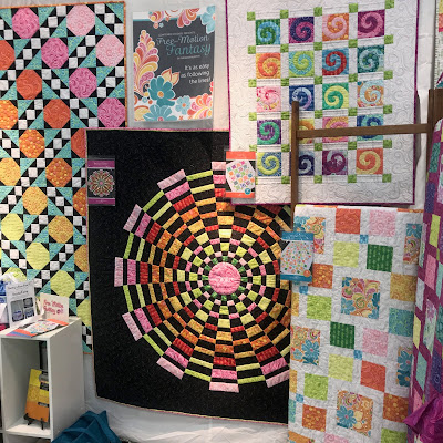
Our Contempo booth was blooming with color and fresh designs from our star-studded line-up of designers! Which quilts will you add to your "to sew" list? It's so hard to choose! 


At left: Cherry Guidry's Front Porch and Words to Live By collections
Right: Christa Watson's Fandangle collection

A closer look at Cherry's "Shades" quilt, made using her Front Porch fabrics. Sew much fun! 

Christa's skirt is made from Fandangle fabric! We love how she coordinates with the booth!
Photo courtesy: Christa Watson

Zip bags? Love 'em!
Photo courtesy: Christa Watson

Christa's quilts are packed with luscious color. 
Photo courtesy: Christa Watson


More from our Contempo booth:
At left, Amanda Murphy's Free Motion Fantasy collection
Middle, Amy Friend's By Hand collection
At right, Printology by Modern Quilt Studio

We love the swirl action in Amanda's quilts! 
Photo courtesy: Amanda Murphy
 Free Motion Fantasy fabric close-up:
Photo courtesy: Amanda Murphy
 Amy Friend's new By Hand collection is rich with rainbow colors

Printology fabrics shine in Weeks and Bill's quilts

More Printology: The sophisticated Modern Quilt Studio booth
Photo courtesy: Modern Quilt Studio

Tour all three booths:
Contempo
Love It? Share It! Facebook Twitter Google Pinterest Email

Monday, December 18, 2017

We're Dot Crazy!

If you're crazy for dots, no doubt you've been (im)patiently waiting for the arrival of Weeks Ringle and Bill Kerr's new collection, Dot Crazy. These bright, fun prints are so much more than dots, and packed full of inspiration. Today we are sharing an interview with Weeks and Bill about their fabrics. This husband and wife team both have design backgrounds (Bill's is in modern art, and Weeks, among other things, is a master Japanese flower arranger). Within a copule meonths of meeting, they made their first quilt together, and their favorite jokes is that when Bill asked Weeks to marry him, he was marrying her for her Bernina. 
They spend their days designing, sewing, teaching and creating their publication, Modern Quilts Illustrated, as part of their business, the Modern Quilt Studio. Weeks and Bill were modern quilters before modern became a thing, and we're thrilled that they've brought their design talents to Contempo Studio!

What made you decide to create a collection based on polka dots?
We work frequently with a Japanese quilting magazine called Quilt Jikan; our aesthetic is very much in line with modern Japanese design. I wanted to do a version of the On the Dot quilt using a whole bunch of different dots. I got our dot collection together from our stash and posted a photo on social media. That picture went crazy! People wanted to know where we got al those dots. Sometimes you think you’re the only person who likes something, but we got such an exceptional response and people wanted to know where we’d gotten all those dots.
"On the Dot" updated with Dot Crazy fabrics

Can you tell us more about Yayoi Kusama and how she influenced you?
She’s a contemporary Japanese artist—really a household name in Japan. All of her work is polka dots. She has nothing to do directly with our fabrics, but her artwork puts polka dots on people’s minds. You’ll be blown away by her work. She’s had a traveling show in American museums this year, and tickets are in ultra high demand. I have a feeling there’s going to be a trickle down of dots into mainstream design because of her work.

Tell us about your dot collection.
I kept telling Bill that I wished we’d had larger dots and more varieties of colors (when making the first On the Dot quilt). In the back of my mind, I had this fantasy of designing a line with a huge number of dots. Most people design dots that are all the same size. To me, that’s missing the point of the fun.
We really wanted this line to be fun. It’s half dots and half prints that are friends of dots. We always want to design beautiful fabrics, but also beautiful fabrics that you can use with what you already have. You can use them with solids, plaids…there are so many different things you can do with them because they’re such a timeless motif.


We’ve always loved circles and dots. We even have a 15-year-old portrait of us in front of a giant dot quilt!


How did you choose what sizes and color combinations to include in the line?
Narrowing down to just 18 SKUs was really hard. If you’re going for this kind of look, you want a ton of dots. At the same time, we wanted both quilt shop owners and customers to look at the fabric and get excited about it—it needed to be visually compelling. For us, one of the checklists that a fabric collection has to pass is "does it look good in a fat quarter bundle?" If you stack up the whole line, are there just three interesting prints, and then a bunch of blenders that you don’t “have” to have? We think that if you stack up Dot Crazy and remove one print, it would look like there’s a hole. Every one of those colors had to be in there.
  
Everyone is talking about the Fun and Games print!
I felt like having a very busy but fun fabric that you could fussy cut and make kaleidoscope with really elevated the line. If we had done only dots, I would have had a voice in the back of my head saying, “it’s just dots.” We love it. It’s just happy as yardage. We like to play around with scale. This print is great on the bolt, but you can cut a 3” square and get a really interesting textile too.


What do you want quilters to think about as they see your fabric?
Our ultimate goal is to get people to make things. We want them to be successful. 
We want to expand people’s definitions of what they thought they could do with a quilt. We’ve created a publication to show people what they can do with these fabrics. Use these prints boldly and mix them in with things you already have. Don’t be afraid to mix them with plaids, florals, novelty prints, etc. The beauty about dots is that they’re timeless and they work with everything. They’re a real chameleon.


Can you even pick a favorite print?
Weeks: It’s got to be Fun and Games for me. But if you asked me my favorite part of the line, it’s the combination of all the prints. I love looking at that fat quarter bundle.
Bill: The pink version of Fun and Games. It’s totally fun.


Click here to see the entire Dot Crazy collection.
Click here to see more of Weeks and Bill's work.

We'll be featuring Dot Crazy all week here on the blog, so come back for your fill of polka dots!
Love It? Share It! Facebook Twitter Google Pinterest Email

Wednesday, November 9, 2016

Good Karma

Everyone loves good karma. 
After today, we think you'll love Karma the fabric collection as well! 

Maggie & Flo's Karma collection for Contempo Studio takes inspiration from the 70's in both the colors and the patterns. The fabrics have a retro feel with modern flair--so much fun! Here's a look at a few of the prints in the line--plenty of small geometric prints, and then an overall leaf print (available in three background colors) that ties all the prints together. You can see the entire Karma collection (24 prints total!) here


Use the Karma prints to make this "Good Vibes" quilt, available as a free download on our website. 
Click here to download the free quilt pattern. 

We'll also give you a sneak peek of a project from the new fall issue of our Modern by the Yard ezine, available soon! 

"Bag Love" is exactly that--a messenger bag you'll fall in love with. It features a few of our favorite Karma prints and is roomy and comfortable to wear. 

And a peek at the Modern by the Yard cover, also featuring Karma

Click here to see the entire Karma collection.
Click here to find the free "Good Vibes" quilt pattern. 
Love It? Share It! Facebook Twitter Google Pinterest Email

Thursday, August 18, 2016

Sgraffito: Pen & Ink Art

Sgraffito is an Italian term that means a form of decoration made by scratching through a surface to reveal a lower layer of a contrasting color, typically done in plaster or stucco on walls, or in slip on ceramics before firing. Sgraffito is also the name of a new fabric line from Contempo Studio by Elise K featuring florals, paisleys, leaves, geometrics, and textures. These pen-and-ink-style designs, done in black and ivory with brown, gray, and taupe accents, create a stunning collection with modern appeal. 

Don't miss our two free quilt patterns, featuring these beautiful earth-tone prints:

"Nico" by Stephanie Sheridan and Linda Leathersich 
of Stitched Together Studios
Click here to download the free quilt pattern.
"Deruta" by Heidi Pridemore of The Whimsical Workshop 
Click here to download the pattern.

Click here to see the entire Sgraffito collection.
Click here to find the free quilt patterns. 
Love It? Share It! Facebook Twitter Google Pinterest Email

Tuesday, August 2, 2016

Color Weave in action: The Frequency Quilt

Today's quilt was featured in Modern Patchwork magazine. Designed by Lisa Swenson Ruble, it uses the Color Weave collection from Contempo Studio. We think the name, "Frequency," perfectly describes the look of the quilt!
"Frequency" by Lisa Swenson Ruble;
featured in Modern Patchwork Spring 2016
We asked Lisa to share some of the inspiration behind the quilt: 

What attracted you to the Color Weave collection?

I loved that each color in the line came in three shades. It seemed perfect for playing with designs that depended on some sort of gradation for the pattern. The pattern in the fabric is a subtle crosshatch--enough to create interest and texture up close, but also have the illusion of a solid from a distance. 

How did you come up with the design? 
I had designed the table runner below for Benartex's Fat Quarterly newsletter. I started out by trying to expand that design into a full quilt, but it wasn't working. I started experimenting with other ways of playing the shades of color of each other and ended up with this design. 


Why do the Color Weave fabrics work so well in this design? 
The variety of shading! Having three coordinating shades--light, medium and dark--of each color gave me plenty of options to work with. Ultimately I only used the light and dark shades of the colors because it created the most contrast. 

How did you choose which colors to use? 
It was hard to choose! I love the palette of Color Weave--it's not your traditional red, blue, green, etc., but rather a more modern version of each color. I tried several color combinations in the design but ultimately stuck with cool colors, which tend to be my favorite anyway. 

Tell us about the quilting. 
I straight line quilted this quilt on my home machine. I think it adds texture without taking away from the impact of the design, and it enhance the modern appeal of the quilt. 

Tell us about the backing. 
I chose a backing fabric from Cherry Guidry's Soul Blossom collection. I loved the little squares, and it was like this fabric was designed for the colors I chose for my quilt--they are all represented on the back! A total coincidence, but fun. 

What do you like best about the quilt? 
I like how each vertical row is spaced differently. I think it really adds to the design, and it was fun to experiment with how changing the appearance of each row changed how the quilt looked. 


Click here to see the entire Color Weave collection. 
Click here to learn more about our Fat Quarterly newsletter.
Click here to learn more about Lisa Swenson Ruble's work. 
Click here to find Modern Patchwork magazine. 


Love It? Share It! Facebook Twitter Google Pinterest Email

Tuesday, April 12, 2016

Take a ride...

...with Cherry Guidry's fresh Sunday Ride collection for Contempo. These prints exude spring--from the light, airy palette to the flowers, bicycles, and sailboats--Sunday Ride is packed with fun! You'll love the allover neighborhood print--fun for backing, wide borders, or fussy cutting. And don't forget the panel!


 The panel:


 Corner Oak Street, a free pattern by Cherry. Make your own neighborhood with this refreshing version of a classic house block quilt. 
Click here to find the free quilt pattern.

Click here to see the entire Sunday Ride collection.

Click here to see more of Cherry's work. 
Stay tuned for more on Sunday Ride later this week!

Love It? Share It! Facebook Twitter Google Pinterest Email

Monday, April 11, 2016

Sevilla!

Go modern with the trendy color palettes and geometric prints of Andrea Komninos' Sevilla collection for Contempo Studio! Dots, dashes, stripes, shapes, and more--each print is more fun than the last! These prints are perfect for masculine quilts, too.


Available in cool blues and greens:

And warm yellows and grays:

Check out our free quilt pattern, New Directions, designed by Janet Page Kessler. The pattern offers directions for making the quilt in either colorway (and it's made from just half-square triangles--super easy!).
Click here to download this quilt pattern.

Click here to see the entire Sevilla collection in the blue colorway.
Click here to see the entire Sevilla collection in the yellow colorway. 
Love It? Share It! Facebook Twitter Google Pinterest Email

Wednesday, February 24, 2016

Bobo Baby: Nursery Cuteness!

We <3 baby prints! Maggie & Flo's Bobo Baby collection for Contempo Studio is everything you want for a baby quilt or nursery. Whimsical giraffes, elephants, turtle and birds frolic on blue, green, pink, and yellow prints--perfect for a boy or girl. 


Our favorite part of the Bobo Baby collection: Bobo the elephant. This fun panel sews up into a 3-D stuffed elephant--so sweet and cuddly!


Looking for an easy baby quilt? Diane Nagle's Bobo the Baby Elephant quilt pattern combines a classic block with sweet elephant appliques. 

Click here to download the free quilt pattern. 

Click here to see the entire Bobo Baby collection.

Love It? Share It! Facebook Twitter Google Pinterest Email

Friday, October 30, 2015

Quilt Market Tour: Contempo Studio


We're back from Quilt Market in Houston with plenty of photos to show you our booth (and give you a sneak peek at some of our upcoming fabric collections!). Enjoy!

A look at the Contempo booth, with a flower shop theme:


The whole booth from another angle:


Projects made from Sarah Vedeler's Transformation collection 
(love those 3-D flowers!)


The soothing greens, teals and grays of Fresh Bloom by Michele D'Amore


The 3-D flowers go perfectly with Michele's Fresh Blooms fabrics!


Mix & Match by E. Vive...a basics collection with plenty of flair!


Quilts made using Cherry Guidry's newest collection, Sunday Ride


A phenomenal Lonestar quilt made using Cherry's Sunday Ride coordinates--all that applique in the center is so striking!


Holiday cheer in Amanda Murphy's new collection, Sparkle! Stockings, snowflakes, and more!
Photo courtesy: @amandamurphydesign

Amanda created coordinating emboridery motifs for these cute bags made from Sparkle (and a peek at a fat quarter bundle!).
Photo courtesy: @amandamurphydesign

Click here to see the Benartex booth tour.
Click here to see the Kanvas booth tour.

Watch for these fabrics to be featured here on the blog and then be available in your local quilt shop in early 2016!
Love It? Share It! Facebook Twitter Google Pinterest Email