Friday, March 15, 2013

Now Serving...Arnold's Diner

Don't you love the nostalgic feel of a diner? Whether you remember diners at their heyday, from movies and television shows (Happy Days!), those beloved mom-and-pop diners that are still thriving, or even just diners reinvented for the present day through restaurant chains like Johnny Rocket's, the very thought of a mouth-watering burger, fries, and homemade shake is sure to make your lips smile and your stomach growl. Let's set the scene, shall we? We'll go for atmosphere only so we don't ruin anyone's diet...

Checkerboard floors and counter and stool service
Photo from: http://sofiatheinsider.wordpress.com/2012/02/25/are-you-a-diner-serving-dinner/

Red vinyl booths!

Photo from: http://www.gameroomwarehouse.com/diner/diner_furniture.html


 That distinctive exterior look.
Photo from: http://longislandreport.org/features/the-future-of-diners-on-long-island/6750


Now that you're in the mood, check out Arnold's Diner, a new Kanvas line by Maria Kalinowski.

What was the inspiration behind this line?
I was inspired by the 1950’s retro Route 66 look that is happening right now.  It's an all-American theme that everyone can relate to. It is a novelty line that has a playful yet very user-friendly whimsical look. I had a lot of fun designing this line. 


Which fabric is your favorite?
I'm not sure I can pick just one. The checkerboard—it's such a bold size and can be used for anything. Everyone remembers the checkerboard floors in diners. They're great for trimming curtains. I used a similar pattern to cover the tables for my son's second birthday party and it really made a statement.

The diners and coffee cups are also a favorite. The coffee cups are so crisp and clean with the retro colors really making them sparkle.


I especially love the menuit has everything that represents childhood, when you were with your parents on those long road trips and stopped at the diner.   The typical American diet: cola, fries, hamburgers and ice cream sundaes.!!!!!!!


What was the most challenging part of designing this line?
To make it unique from any other lines featuring this theme.  I was aiming for a bold and graphic style. Diners of that time period were sooo shiny and clean and graphic.

What do you envision this line being used for?
I can see aprons, mitts, placemats, quilts, pillows…how about curtains in a breakfast nook or a lunch bag?  Anything really for table top or home décor.


These cafe curtains brighten up the kitchen at the Benartex/Kanvas office!

Thanks Maria!

So...we've gotta ask! After seeing this line, where are you headed first--to your local quilt shop, or to get a hamburger, fries, and a shake?! 


Love It? Share It! Facebook Twitter Google Pinterest Email

Tribute to Pat Campbell

We mentioned it on Facebook yesterday, but wanted to take a quick minute to remember Pat Campbell here on the blog as well. We were saddened to hear of her passing, and send along thoughts and prayers to her family and friends. An extremely talented quilt artist, designer, and teacher, Pat will be dearly missed by quilters and the entire creative community.

Pat designed the Fossil Fern collection for Benartex more than 15 years ago, and it is still in demand today--so few lines have such a lifespan--it is truly special.

Thank you, Pat, for everything you gave to the quilting and sewing world. You will be missed!

Love It? Share It! Facebook Twitter Google Pinterest Email

Tuesday, March 12, 2013

Creativity in Every Breath

Since this blog started, we've been showing you some of our favorite new Kanvas collections, but we haven't really talked about who is behind the Kanvas name. 

Meet Maria.


Maria Kalinowski is the creative force behind Kanvas, Benartex's new division featuring novelty prints and more. And what a force she is! Head into your local quilt shop, and chances are, you'll be able to identify Kanvas prints simply by their fresh, graphic look. From popsicles to beer bottles, and the New York skyline to retro diner prints, you'll find designs that make you smile, ready to be used in your next project. Maria designs fabric lines herself and also works with a select team of artists to create everything Kanvas. She recently spoke about her work and her design process.


Tell us about your background.
Art is not what I do but who I am, I have been painting and drawing since I was a child and come from a long line of dress designers and graphic designers in my family. I never had any question about what I was going to do in my life, it came completely naturally.

My background is formal training in the fine arts. During high school I painted primarily in watercolors, landscapes, barns and was very well known for my florals. During one of my art exhibitions in Connecticut a professor had mentioned that my paintings looked like fabric designs. This is where the idea came to me that maybe I should pursue a career in textile design. I was one of the youngest members of the Ridgefield guild of Artist’s where I participated in many juried art shows, sold and had one-man exhibitions throughout Fairfield County, Connecticut. I then graduated from Rhode Island School of Design in Providence Rhode Island, with a BFA degree in textile design.

Upon graduating I took my first job on 7th Avenue designing women’s fashion as a board artist, and the rest is history.

What do you like best about designing fabric?
I chose fabric design primarily because it is a mix between the fine arts and design. There are no limits to what you can use fabric for these days, and it always surprises me to see how the quilters and manufacturers create products or quilts with my fabrics. Quilting and sewing is a whole other talent in itself. I am awed and amazed at what the quilters create from so many tiny pieces of fabric. 

How would you describe your style?
I would say my style is eclectic with an edge. I have a love for designing beautiful elegant more traditional lines, such as my blue horizon peacock as well as my bold, edgy novelties that evoke humor and a definite point of view. 

What do you do in your free time?
My free time is limited as I commute to New York from Connecticut and have a 12-year-old son David. He keeps my weekends pretty busy and is the joy of my life. I do love theatre, movies and concerts. But mostly I spend my time entertaining family and friends in my home in Westport.

Where do you get your inspiration from? 
My mind never rests. I get inspiration from everywhere and am always looking for the next new concepts. I draw from life such as my hero dogs print came from the 10th anniversary of 9/11 that just passed. So TV, world events, movies and magazines are what inspire me. It is endless and can be a bit exhausting because there is no way to turn it off. It is who I am.

Do you name the fabric collections yourself?
We have so much fun naming the fabric collections. Sometimes the names come before I have even conceived the designs and sometimes the groups help give us the names. This is my studio's favorite part.

What else can you tell us about yourself?
I have been told I have a flare for the dramatic that makes me a great storyteller with a comedic edge. People who are not in my close circle don’t see that side of me. Most people think because of my flare for fashion that I live in NYC, but actually I live in a country farmhouse near the beach in Connecticut. I think the solitude after the hustle and bustle of my busy weeks is what rejuvenates me.


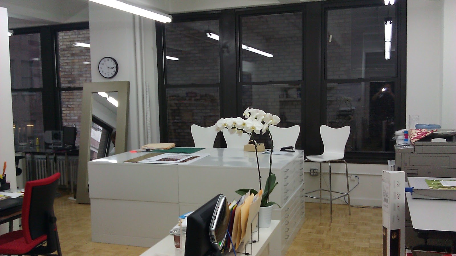
Check out Maria's studio...where all the creativity happens!


Love It? Share It! Facebook Twitter Google Pinterest Email

Monday, March 11, 2013

Winners!

Last week we announced a giveaway to celebrate reaching 3000 followers on Facebook. Today, we're back with the winners, each of whom will win a fat quarter bundle!

Using random number generator, we selected winners from the comments about how you're following us (Thanks so much for following us--we love to be able to share our new fabrics, inspiration and other news with you!). 

Here are the winners:

#35 was Marcia:
**Marcia: Please contact us at sewinlovewithfabric (at) gmail.com so we can get your mailing address.**
  

 #18 was cgd:


**cgd: Please contact us at sewinlovewithfabric (at) gmail.com so we can get your mailing address.**

 #96 was Sober Brat:
Sober Brat: We have sent you an email to get your mailing address.

If we don't hear from Marcia and cgd by Wednesday March 13 at noon, we will pick new winners. 
We didn't hear back from one of our winners, so teachpany was randomly selected and contacted instead. Thank you!


Thanks to everyone for participating!
Love It? Share It! Facebook Twitter Google Pinterest Email

Friday, March 8, 2013

Let's Go Large!


Designer Ann Lauer of Grizzly Gulch Gallery used the Somerset collection by E. Vive in two of her newer patterns, Star Struck and Sew Classy. Today, she's sharing these quilts with us and talking about why the fabric works so well in them.

Star Struck by Ann Lauer

Sew Classy by Ann Lauer

So you're a lover of big prints?
I love large prints that are real showy. They're just so vibrant and exciting, and they even show off beautifully from a distance. Plus, the tonal supporting fabrics work so well with the focals. They create quiet time.

How did you use these big prints in your two patterns, Star Struck and Sew Classy?
Both of those patterns use a 10'' square of the focal print, which is big enough to truly show off the flowers. There's enough variation in the fabric design that I was able to fussy cut the squares differently—I didn't have to repeat the same flowers in a square over and over again.

Tell us about your design.
I used a Nifty Notions tool called the half rectangle tool. It's a very simple tool to use, and it created several elements in each quilt—that's how I made the black frame around the floral squares in Sew Classy, as well as the green triangles in the sashing. For a totally different look, I used the tool to make the blue star points in Star Struck. These two quilts look so different considering they are made up of many of the same elements. Between the focal fabric and the tool, you get a real showy quilt with either one.

What's one thing you really like about Sew Classy?
I love the jazz of the stripe in the border. And I think the black background is so striking on the focal print. Okay, that's two!

How about Star Struck?
It's a quilt without borders. I've been designing more like this. A bit more contemporary. The quilt looks difficult to make, but it's actually pretty easy.

We're pretty sure we know the answer already, but what is your favorite print in the Somerset collection?
The large floral. It's really striking, and it's such a nice combination of lots of varieties of flowers, but also enough negative space to let the design breathe. You can it in many different ways and you'll always see the background.


(Note: We left the rulers in on these swatches so you can see how large these florals truly are!)

Visit our Facebook page to see a video interview of Ann from Quilt Market.
Click here to visit Ann's website, Grizzly Gulch Gallery, and find the two patterns shown in this post.
Click here to see the whole Somerset collection.

Love It? Share It! Facebook Twitter Google Pinterest Email

Thursday, March 7, 2013

We LOVE Googlies!

Those pointy purple teeth and a three wobbly eyeballs...it was love at first sight with this sweet little monster (and all his friends!).


Michele D'Amore's whimsical and fun Googlies line is attracting attention in quilt shops everywhere. And really, what's more lovable than a goofy monster with a friendly smile? 

When we saw Wendy Sheppard's "Now I Know My ABC's" quilt in the March/April 2013 issue of Fons & Porter's Love of Quilting, we had to share it!


The quilt and the fabrics themselves can only be described as happy!


Wendy fussy cut the alphabet panel and then framed each square with one of two patchwork designs. "I just played around with the fabric to come up with the different settings for the squares," she said. 

Her tip for fussy-cutting squares? "Know the size square you need and make sure the design is centered before cutting. Sometimes you may have to cut off a little bit of the design, or include something not in the design, but blocks will look best if the design is centered."

Her favorite prints? The patchwork stripe for the border: "It really makes the quilt by pulling all the colors together."

And the overall patchwork print on the back, "which looks like another quilt itself."


Head over to Wendy's blog to see more details from this quilt and read about how she designed it. 


You can find the pattern for this quilt in Love of Quilting.

Do these Googlies prints put a smile on your face? We hope so!
Love It? Share It! Facebook Twitter Google Pinterest Email

Tuesday, March 5, 2013

Hooray for 3000 Followers Giveaway!


Did you know? Our Facebook page recently hit the big 3-0-0-0! Thanks to all our friends who follow!

What better way to celebrate than by giving away fabric?
You will have up to three chances to win one of 3 fantastic fabric bundles! 
Somerset


In the Dog House

Tree Frog

You can enter to win one of these tempting bundles in one of 3 easy ways: 
(Notice a theme here with 3?!)

1. Sign up to follow the blog (right hand sidebar) and then leave a comment here, telling us that you have done so.
2. Sign up to follow the blog via email (right hand sidebar) and then leave a comment here, telling us that you have done so.
3. Like us on Facebook and then leave a comment here, telling us that you have done so. 

The giveaway will be open until Friday, March 8th at 11:59 EST. On Monday, March 11th, we'll announce the randomly drawn winners, here on the blog, so check back to see if it's you!

Good luck!


Love It? Share It! Facebook Twitter Google Pinterest Email