Pages

Friday, December 28, 2018

Jubilee and Jubilee Holiday Virtual Trunk Show

You've seen the sparkle, shimmer and shine of Amanda Murphy's gorgeous Jubilee and Jubilee Holiday collections. Now it's time to see the quilts! We're starting off with the quilt that started it all--the Bernina 125th Anniversary Quilt. Follow along on Bernina's website to be part of the quilt-along. 

Bernina 125th Anniversary Quilt
65-1/2" square
"I see this quilt as a mixture of modern and traditional. It features classic blocks, but the layout is modern with the big open border space. My favorite part of the quilt is probably the quilting in the border and how it really integrates the octagonal framework of the quilt itself. The digitized quilting motifs are available as part of the embroidery collection." 
Click here to follow the Quilt-Along.

See Amanda's additional patterns:
Diamond Jubilee
68-1/2" square
"This quit is very dramatic looking. I think the gray background with the gold/yellow prints creates a modern look. It's paper pieced, but a very simple paper piecing, and then it's just appliqued onto the background."
Click here to purchase the pattern.

Platinum Jubilee

65" x 90"
"This pattern is 10" square friendly, but I used yardage because I wanted to make it without the red. It experiments with piecing in the sashing rather than the blocks."
Click here to purchase the pattern.

Here's the red and green version using Jubilee and Jubilee Holiday: 


Ruby Jubilee
56-1/2" x 80-1/2"
"This is a take-off on a classic red and white quilt. It's a fun quilt to piece, with multiple different blocks. I wanted a quilt that used primarily the red prints from the collection. I think this would look interesting in black and white as well!"
Click here to purchase the pattern.

And the red and green version:


Hanging Ruler Organizer
"With my Good Measures rulers coming out, I wanted to sew an organizer for someone who hates making bags, like me. It's super easy--you quilt the fabric, then topstitch the pockets on, and add the binding." 
Click here to purchase the pattern.


Christmas Magic Tree Skirt
"I designed this quick and easy tree skirt (made using 2-1/2" strips) for my upcoming Christmas Magic collection and then couldn't resist making it in Jubilee Holiday!" 

Click here to purchase the pattern.


Star Jubilee
(shown here in green!)

"This free quilt pattern is available on my website and uses a section of the ruler panel."
Click here to download the free quilt pattern.

Interested in the Holiday Jubilee versions of Amanda's Jubliee patterns that you see here? Click here to find the yardage details you'll need. 


Lucky
74-1/2" x 90"
"With all the greens, I couldn't resist a St. Patrick's Day themed quilt!"
Click here to purchase the pattern.


Technicolor
58-1/2" x 58-1/2"
"Originally designed for my Free Motion Fantasy collection, I love how this quilt looks in Jubilee!"
Click here to purchase the pattern.
Click here to download the yardage substitutions.

Click here to learn more about the Jubilee collection.
Click here to learn more about the Jubilee Holiday collection. 
Click here to see our interview with Amanda about the original Jubilee collection.

Did you enter our Win-It Wednesday contest for Jubilee fabric? Find it on our Facebook page.

Thursday, December 27, 2018

Amanda's Jubliee Holiday

If you admired Amanda Murphy's Jubilee collection and thought that it needed a little green to make it perfect for the holidays, you weren't alone!
Jubilee Holiday, available this February/March, features the same elegant motifs from Jubilee in a wider palette--various shades of green, as well as a couple darker red prints.

Take a look:

Jubilee Holiday also includes different color options for the panels: 


Click here to see the Jubilee Holiday collection. 
Click here to see our interview with Amanda about the original Jubilee collection.

Did you enter our Win-It Wednesday contest for Jubilee fabric? Find it on our Facebook page.


Stop back tomorrow for a virtual trunk show of Amanda's quilts using both the Jubilee and Jubilee Holiday collections. 

Monday, December 24, 2018

Jubilee by Amanda Murphy


We're excited to be sharing Amanda Murphy's Jubilee and Jubilee holiday collections with you this week! Bernina asked Amanda to design a collection that celebrates their 125 years in business, and the results are these gorgeously elegant prints. Start with metallic golds and creams, and then add in rich blacks and Bernina's signature color: red! 
Today Amanda shares the story behind the Jubilee collection. 


How did the Jubilee collection come to be?
Bernina gave me the paisley motif and asked me to design a fabric collection and a quilt to go with it to celebrate their 125th anniversary.They wanted me to take the feeling of the paisley and build a collection off of it.

Let’s talk about the color palette.
It originally started with gold and cream—those are the colors used in the Anniversary quilt I designed. I wanted to add some other colors to create different looks. First the gray, and then the red—Bernina red! Some of the prints in the collection have metallic accents, and others have a pearlescent finish.

What about the panels?
There are two different designs. The emboirdery panel has a big rectangle in the center which includes the motifs used in the Anniversary quilt. That way if someone wants to make the quilt without doing the embroidery, they can fussy cut the designs from the panel instead. 


The second panel is for ruler work and can be turned into smaller projects.


Tell us about some of the prints in the collection.
It starts with the paisleys. There are six colors: gold, gold/red, gold/black, black/white, and then black tonal and cream tonal. I like the gold paisley, but I’m really drawn toward the black and white too.


The Herringbone is a great print for binding. The paisleys have a more traditional feel, so I skewed the blenders to be more modern, like this one.


The Diamond print is a great blender. I like to be able to quilt crosshatching without marking, so I almost always have a print like this in my collections—I just follow the lines of the print as I quilt.


My favorite print is the Floral. It’s really heavily pearlized, and so different. It’s an unexpected print that is a blender but not, and adds modernism to the collection.

We'll be sharing more Jubilee inspiration (+ Amanda's new line, Jubilee Holiday!) this week, so stop back for more fun!
Pssst...watch for a Jubilee-themed Win-It Wednesday on our Facebook page.
Click here to see the entire Jubilee collection.
Click here to visit Amanda's website and get a sneak peek at her Jubilee quilts. 

Friday, December 21, 2018

Stone Cottage 2: Green & Blue Basics

We've added to the original Stone Cottage prints--check out these greens and blues--they're such wonderful blenders! They're the perfect coordinates for Thomas Kinkade's new Inspiration for Living collection. 


Fussy-cut blocks to use in the Foxglove Cottage quilt (pattern available on our website!)
Click here to download the free quilt pattern.


Click here to see the Stone Cottage 2 collection.
Click here to see the Inspiration for Living collection.
Click here to see the original Stone Cottage coordinates (cream, red, and navy!).
Click here to download the free quilt pattern.

Monday, December 17, 2018

Thomas Kinkade's Inspirations for Living

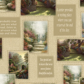
Sit back, relax, and enjoy the peaceful scenery in Thomas Kinkade's well-loved artwork. Our newest Kinkade collection, Inspirations for Living, combines his painted scenes with inspirational quotes. Fussy cut the panels and pair them with the text prints to create a quilt with a special message for someone you love. 

Pathway to Paradise:


Foxglove Cottage:


Hometown Chapel:


Click here to see the entire Inspirations for Living collection.

Friday, December 14, 2018

FREE Pattern Friday! More Is MORE

We've been sharing Paula Nadelstern's More Is MORE fabric collection and quilts made from it all week. If you're like us, you're ready to make a quilt with these gorgeous prints! 

Download our FREE quilt pattern, "Fusion," designed by Stephanie Sheridan of Stitched Together Studios and start sewing! 
Click here to download the pattern.

Click here to see the entire More Is MORE collection. 
Click here to read Paula's interview about designing More Is MORE.
Click here to visit Paula's website and see more of her work. 
Learn more about her unique design strategies in her book, "Fabricadabra: Simple Quilts, Complex Fabrics" from C&T Publishing.

Thursday, December 13, 2018

Paula Nadelstern: Virtual Trunk Show

Seeing quilts made with Paula's fabulous fabrics are a real treat, and this past fall at Quilt Market was no exception. We celebrated 20 years of Paula designing fabric and showcased a gallery of quilts made using both More is MORE and her upcoming Piece & Joy collection. Today we're sharing a closer look at a few of these quilts. 


"Stripe-Adelic" by Paula Nadelstern
"I fell in love with the Stripe-Adelic print the first time I used it in a quilt and a trove of cutting options was revealed more exciting than I’d anticipated. I could cut it randomly from left to right or symmetrically from the center out. I could attach it with fascinating results to a patch from its own colorway or to a different one. Connecting a strip of Stripe-Adelic to another fabric created fascinating results, often softening and camouflaging the seams. The result is a smooth transition from patch to patch and the illusion that there is no seam at all. This quilt is a simple Rail Fence."

Close-up:


"Tivoli" by Ricki Selva
This quilt pairs mandalas with fussy-cut wedges to create a design with incredible depth! 

Close-up:


"More Fabricadabra Butterflies" by Peggy True
Based on a quilt made using Paula's Fabricadabra collection, these butterflies are made using fussy-cut sections of Fusion and Rabbit Hole for the wings, and Stripe-Adelic for the bodies. Little on-point squares of Mosaic make beautiful pieced sashing strips, and the same print is used in the border.

Close-up:


Click here to see more of the quilts displayed at Market made using Paula's More Is MORE and upcoming Piece & Joy collections.
Click here to see the entire More Is MORE collection. 
Click here to read Paula's interview about designing More Is MORE.
Click here to visit Paula's website and see more of her work. 
Learn more about her unique design strategies in her book, "Fabricadabra: Simple Quilts, Complex Fabrics" from C&T Publishing.

Wednesday, December 12, 2018

The Stories behind More Is MORE


Earlier this week, we shared Paula Nadelstern's new More Is MORE collection with you. It's fabulous, isn't it? Today we're sharing the details behind the fabric line with you. Keep reading as Paula walks through the different fabrics, explaining what inspired their design and how she sees them being used. Enjoy!

Where did the More Is MORE name come from?
In 1996 I wrote my first book for C&T titled Kaleidoscopes & Quilts.” That fall I was thrilled to be at Quilt Market in the C&T booth. I sat down with my black, fine-pointed, permanent pen and realized I had to quickly come up with a catchy personal phrase to sign in the book. I wrote: REMEMBER! When it comes to fabric, more is MORE! At the time I didn’t know the phrase would turn into a trademark slogan that I would continue to use for the next twenty-two years, signing over 60,000 copies of six different C&T titles. Or that the sixteenth quilt in my KALEIDOSCOPIC series, titled More is MORE, would be voted among the “100 Best American Quilts of the 20th Century” by a national panel of quilt experts in 1999. It is now in the collection of The American Museum of Folk Art.  

How do you vary your kaleidoscope medallions from collection to collection?
The More is MORE Medallions have a different layout than previous collections. Instead of two sizes of Medallions, each 24” paneI yields four 10” mandalas (two each of two different designs), six 7” mandalas (three each of two different designs) and four 4” mandalas (two each of two different designs). I recommend purchasing two panels instead of a single 24” panel so you’ll have more repeats. Please note, cutting the pattern at 36” instead of 24” will cut a Medallion in half.   


Can you talk about the color palette?
Colorwise, my intent was to include more neutral or white or what I call “seam foam” into the palette. The Sea Foam concept is one of my design strategies, a personal favorite. It’s my go-to method to brighten up and energize a design. For some universal reason, the eternal ebb and flow of white frothy swells against a dark shimmering sea is simultaneously stimulating and soothing. I think it’s because the staccato rhythm of foaming whitecaps compels the eyes to move around in a very satisfying way, searching for the next frothy swell. I usually want to introduce this same lively quality my quilts. Don’t assume that using a fabric with a light-colored background will animate a design. Placing a light-colored fabric next to a dark one will cause a blatant line of contrast which may stop the visual motion not increase it. If you want to shed light onto your quilt, let the fabric do it. Choose fabrics with luminous, light-colored motifs that stand out against their darker backgrounds, like these Mandalas.


How did the Rabbit Hole print get its name? 
Designing this pattern was like going down the figurative rabbit hole. Each level of complexity lead to another until it became difficult to stop myself from pursuing an additional detail here, a doodle there, which led to more…and more… patterning. But in the end, this assortment of motifs doesn’t seem nonsensical or confusing. I feel like it will never cease to yield more….and more…possibilities. 


Can you talk about how you envision the stripe being used? 
Stripe-Adelic is elegant and wacky at the same time with its strong sense of movement and playfulness. In each collection, I try to invent a pattern that fits the category I call Directionals. A Directional slides the eye from here to there, forming visual pathways that instill an element of motion. A stripe is an expressive tool because each basic direction has its own personality. Horizontal lines move the eye across the field, imparting calmness and stability, calling to mind both the horizon and our sleeping posture. Vertical lines are more visually active, suggestive of plant life that grows from the ground up. Diagonal lines, slanting from corner to corner or radiating from the center out, are energetic, implying imminent change. Keep this in mind and aim Stripe-Adelic in any direction. 


What makes the Mosaic print so user-friendly? 
Mosaic is an All-over print. All-overs are nondirectional designs with a forgiving temperament that look the same from any angle. There is no implicit top, bottom, left, or right. My litmus test to check for a true All-over is to randomly fold the fabric and look to see if the juncture where the end meets the rest of the fabric is noticeable or disappears. If the juncture is visible, the design might be too directional for the desired purpose. When a true All-over, like Mosaic, is randomly folded on itself, the junction where the two areas meet disappears.


What details do you like best in Fusion?
As soon as I looked up at the Prague Spanish Synagogue Ceiling, I knew I’d found a quilt idea. Here was a glut of architectural designs filled with patterns bumping into each other. I saw the ceiling in 2014 and finished the quilt in 2018, using over 80 different fabrics I’d designed with Benartex in the past 20 twenty years. Click here to see it.

For an approximately 10” x 20” area toward the quilt’s center bottom, I pieced together about 50 patches from 9 different fabrics from different collections. Of course, I’m counting in hindsight and now that’s the quilt is quilted, sometimes I can’t even find the seams.


I got the idea that this section might be the foundation for a brand-new fabric. About fifty tweaks later it turned into FUSION, which is defined as the process of joining things together to form a single entity. 


Click here to see the entire More Is MORE collection. 
Click here to see more photos of More Is More.